rina kouch. ヽ(✿◕ᴗ ◕)ノ彡☆
UX Focused CAD Designer, Junior Machinist & Certified Hobby Enthusiast
Nice to meet you, I’m Rina. Welcome to my portfolio!
ヽ༼ຈل͜ຈ༽ノ
Understanding your users is an important part of the whole picture.
Applying that knowledge is a focus of mine to ensure your clients are left happy.Let’s build your whole picture together.
“Who are you?”
I’m a user experience focused CAD designer & junior machinist with additional experience in both development & customer support. My focus is on researching usage patterns, recognising needs within the target audience and recognising those with disabilities.
During my off time, I enjoy my hobbies throughout the week. Every morning, I wake up to *attempt* to make latte art with my home coffee set-up. I love learning various styles of traditional archery, including English, Japanese, Chinese archery and more. I also assist with instructing beginners at Box Hill City Archers.
“Why should I care?”
Good question! Let’s talk about it - what kind of person do you want to work with?
A team needs the kind of person who works well with others, learns quickly and can communicate effectively. A researcher with the skills and empathy to recognise your users and their needs. A designer with an understanding of your brand, who ensures your product’s ease of use.
If this is the kind of person you wish to work with, then say hello! 👋
Since my youth, I’ve had a strong background in science and technology, and research has always been part of my bloodstream. This means I know how to approach a problem and ask appropriate questions where necessary. Speedy absorption of information and skills is a powerful tool in my repertoire that I am genuinely proud of and shows when working.
“What about your portfolio?”
- My Design Process
- Projects
- Access Control Dashboard
- Box Hill City Archers
Links
📝 My Design Process
Everyone’s process is different. So what makes mine tick? From my experience, being able to lay out the foundation of a design is important to not only create context and specificity, but to also stay on track.
Problem Introduction
The problem introduction outlines what needs to be done and the problem that the users might want to solve. To understand what is being designed, is a critical part of ensuring the design does not become too broad, while still maintaining a level of specificity.
Problem Analysis & Research
During this stage, the problem is further broken down and each part is researched. The research allows for the parts to have meaning with specificity that is hard to misunderstand.
History
When trying to understand the context of the problem, research needs to be done to understand whether there is period bias. The history of the product or company can provide context to the solution and bring hidden issues to light.
User Needs
Differing to the needs of the product itself, and the needs of the stakeholders, the elements of the product that the user cannot be without, have to be defined to understand any gaps between each category of needs.
User Flow
How the user interacts with the design and makes decisions in what steps to make next is crafted from the User Flow. What they want to achieve, and how they achieve it while maintaining cultural requirements helps describe the solution.
Wireframes & Design
The wireframing phase of design allows for a layout and experienced focused thinking, without the distraction of colors or content. Once the wireframes are complete, a semi-interactive design is made and is tested.
Design Reasoning
Alongside the wireframes and design, the reasoning of the designs go hand in hand. It will both explain the proximity of elements and the layout, while also providing context to things that are invisible in the design, like special interactions.
User Testing
After a public solution has been developed, user testing is performed to ensure the actions of the users of this product lines up with the needs of the solution. When things do not line up, another iteration of the research and design is performed.
Conclusion
Upon completion, a conclusion is written to finalise the project - things such as, what went well, what didn’t work, what key information might be important if the project needs to be picked up by a different team in the future.
🔐 Access Control Dashboard
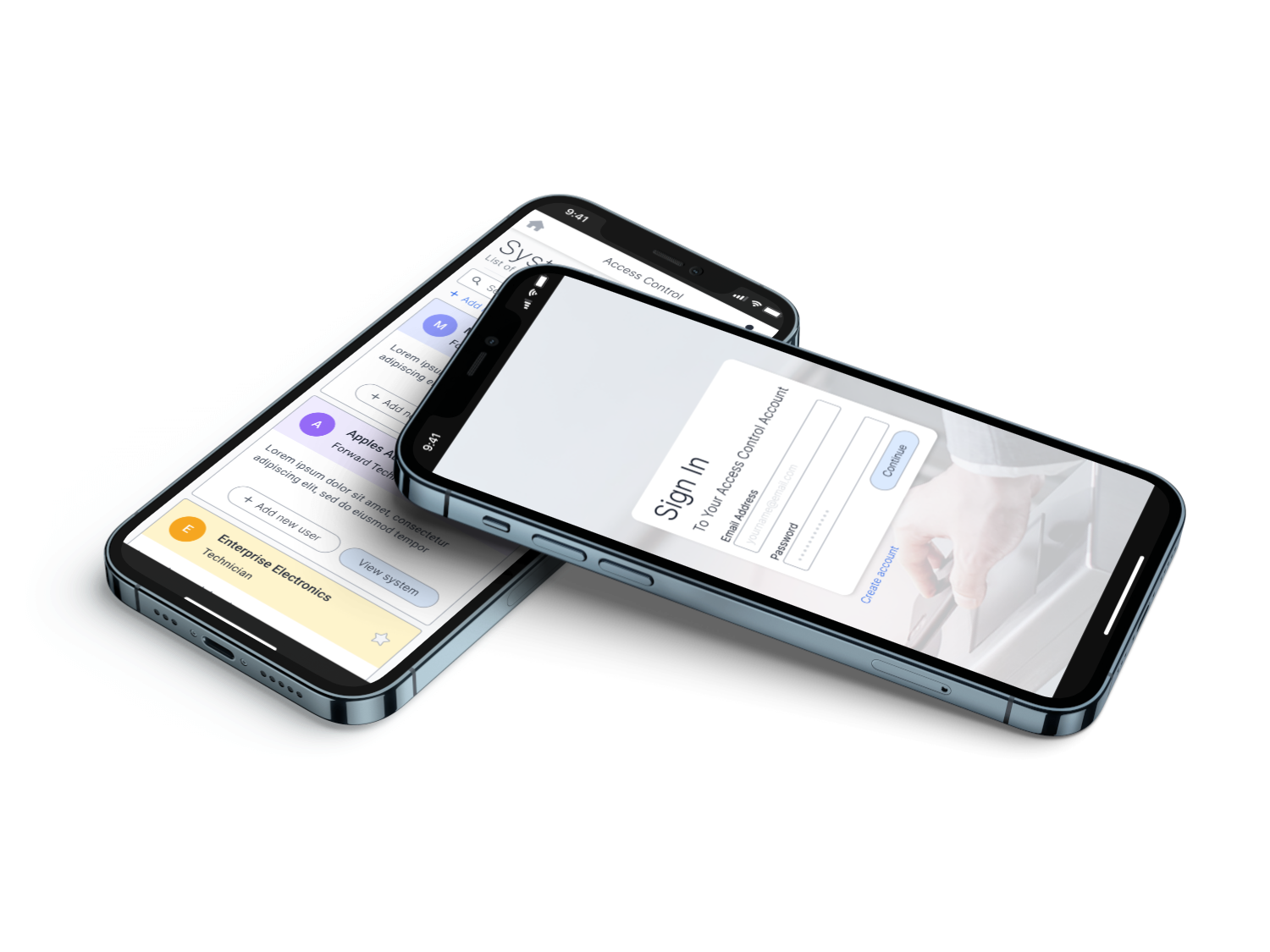
This web app is designed to make access control management of mobile credentials easier. It allows management to effortlessly control who can enter specific areas in the building. The management may need to have access to multiple systems located at different premises.
Designs
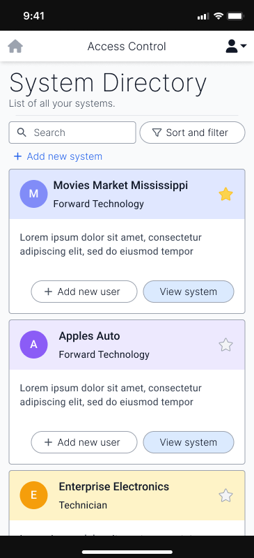
Directory
In this screen, the users will see an overview of the systems they have access to. With some people having few systems, to others having many, it was important to display this information in an easily scannable format. The use of colours is significant to the scannability as well as an icon to the left of them, that the manager of the system can add to further increase scannability.
Down the line, this layout may be too cosy for people with access to large numbers of systems and may require a more compact version. If the need for such a design is met, the compact version may be developed.
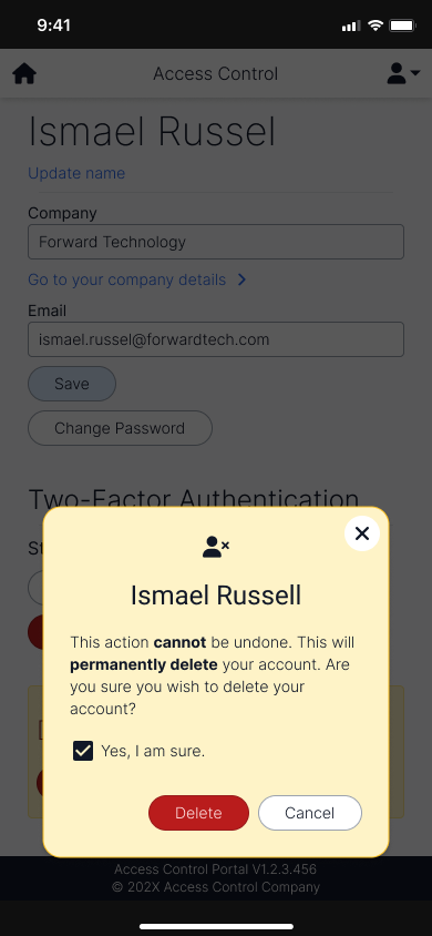
Danger Dialogues
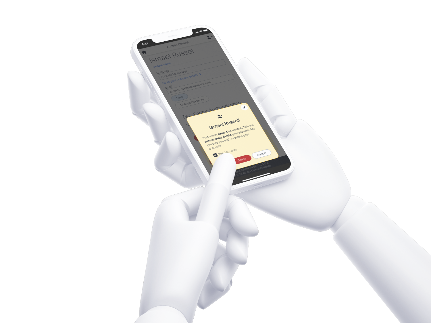
Clear signalling for negative actions are significant to show the actions the user might take. This specific dialogue shows the user deleting their own account. As this action is a critical action, a checkbox is added to confirm that the person understands what they’re doing, before allowing them to do so.
Entity Lists
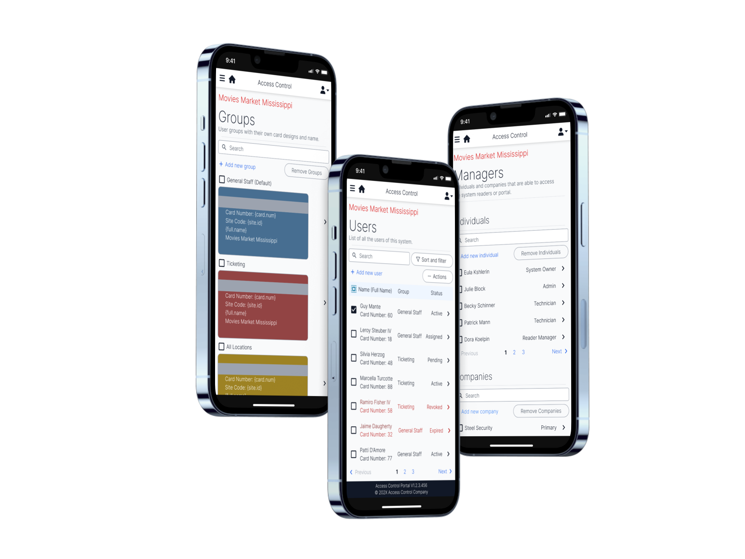
The groups page allows for quick recognition of the user’s accessibility of the physical areas, and is customisable to the company’s preferences and branding.
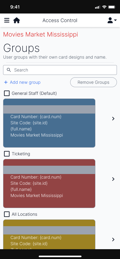
The users page shows the separation between the status of the users that may need attention. In a grid layout, the users can be easy recognised by group.
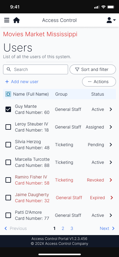
Similar to the users page, the managers page allows for the control of who is able to access this particular system. It includes both companies (individuals of a company can access it), or individuals, themselves.
The desktop layout of the user’s page resembles the two user screens but makes better use of the size of a desktop landscape layout. The two screens are side by side to allow for quick editing and viewing of users.
Conclusion
When presented to testing teams, we saw the users find familiarity in the naming of the different sections, such as groups, that also appear in access control software. They were able to identify the relevant features they wanted to use in a short period of time and overall, enjoyed the experience.
However, due to a lack of design system, some elements—such as the search field—do not feel as connected to the rest of the design. This also made it more difficult to achieve a design that resonated with the company.
Overall, the design was clean, and achieved an experience sufficient for a first release. However, the design may not have been tested sufficiently with real world users and could result in misguided user experiences.
🏹 Box Hill City Archers
“What is Box Hill City Archers?”
Established in 1948, Box Hill City Archers is a social archery club located in Box Hill. They run beginner courses, and organise regular competitions for their members.
Projects
- Club Shirt
- Website Redesign
🏹👚 Club Shirt
What did I learn from this project?
- This project required me to learn how to approach a new medium of design, a physical shirt.
- Interviewing members of the club, as well as members of other clubs.
Introduction and Considerations
BHCA’s (Box Hill City Archers) club shirt needed an update as there have been updates to the logo and values of the club. So, I set out to try to design a shirt that met the requirements of both the club and the club members.
What the club wanted out of the shirt was:
- Contains the logo
- Is a polo-style shirt
- Shows individuality and community of the club
Some requirements from the members included:
- Hides sweat
- No light colours over chest areas for consideration of breasts and/or bras
- Visible club logo while shooting, with or without chest guard (covers one side of the chest)
Designs
Initial Design
Focusing on the layout and requirements of the shirt, I started the design in black and white. Ideas were presented by another member, from which I took inspiration from.
Additional Requirement Consideration
Seeing that the right-hand side armpit/chest area still lacked a dark tone to hide sweat/bras, I looked upon what textures I could add.
Alternate Styles
In search of different styles, a few more designs were made to contrast the previous ones, even if they were not ideal. These designs were either not approved, or rejected by most people they were presented to.
Added Accents
Finally, feedback was received that at first glance, the shirt was an equestrian club. In response, arrows from the logo were placed on the back of the shirt to emphasise the archery aspect of the shirt.
Conclusion
While this project isn’t yet complete, working with considerations and the look into the locality of BHCA for the designs was an enjoyable experience.