🔐 Access Control Dashboard
This web app is designed to make access control management of mobile credentials easier. It allows management to effortlessly control who can enter specific areas in the building. The management may need to have access to multiple systems located at different premises.
Designs
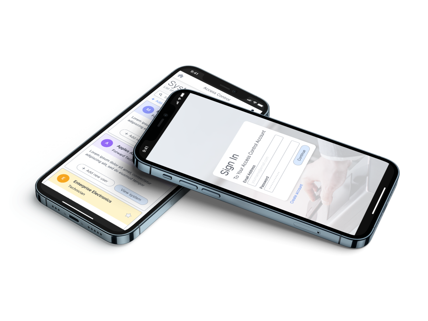
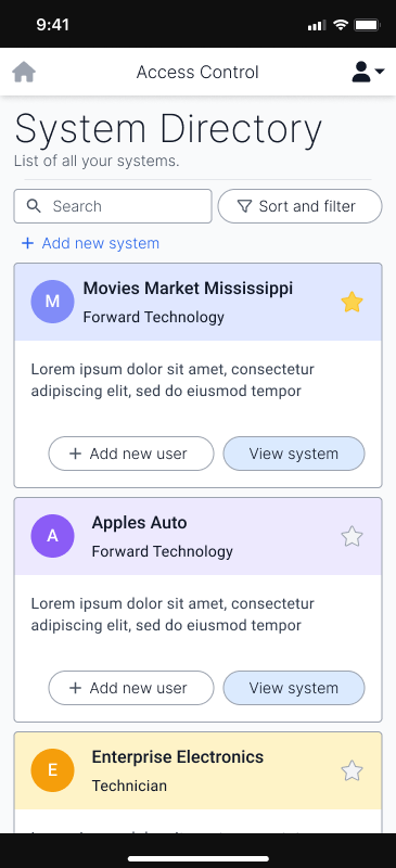
Directory
In this screen, the users will see an overview of the systems they have access to. With some people having few systems, to others having many, it was important to display this information in an easily scannable format. The use of colours is significant to the scannability as well as an icon to the left of them, that the manager of the system can add to further increase scannability.
Down the line, this layout may be too cosy for people with access to large numbers of systems and may require a more compact version. If the need for such a design is met, the compact version may be developed.
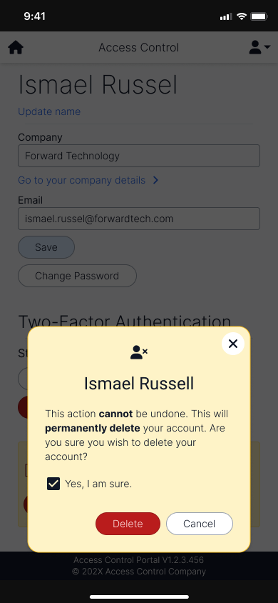
Danger Dialogues
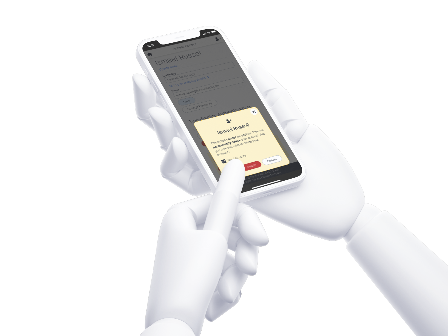
Clear signalling for negative actions are significant to show the actions the user might take. This specific dialogue shows the user deleting their own account. As this action is a critical action, a checkbox is added to confirm that the person understands what they’re doing, before allowing them to do so.
Entity Lists
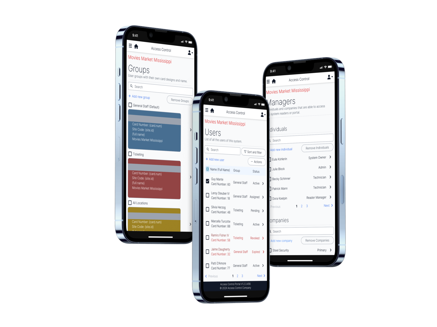
The groups page allows for quick recognition of the user’s accessibility of the physical areas, and is customisable to the company’s preferences and branding.
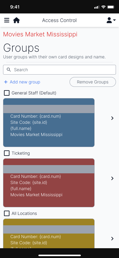
The users page shows the separation between the status of the users that may need attention. In a grid layout, the users can be easy recognised by group.
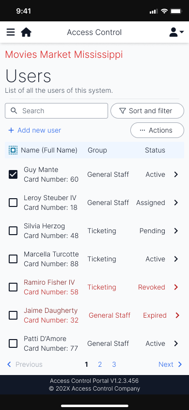
Similar to the users page, the managers page allows for the control of who is able to access this particular system. It includes both companies (individuals of a company can access it), or individuals, themselves.
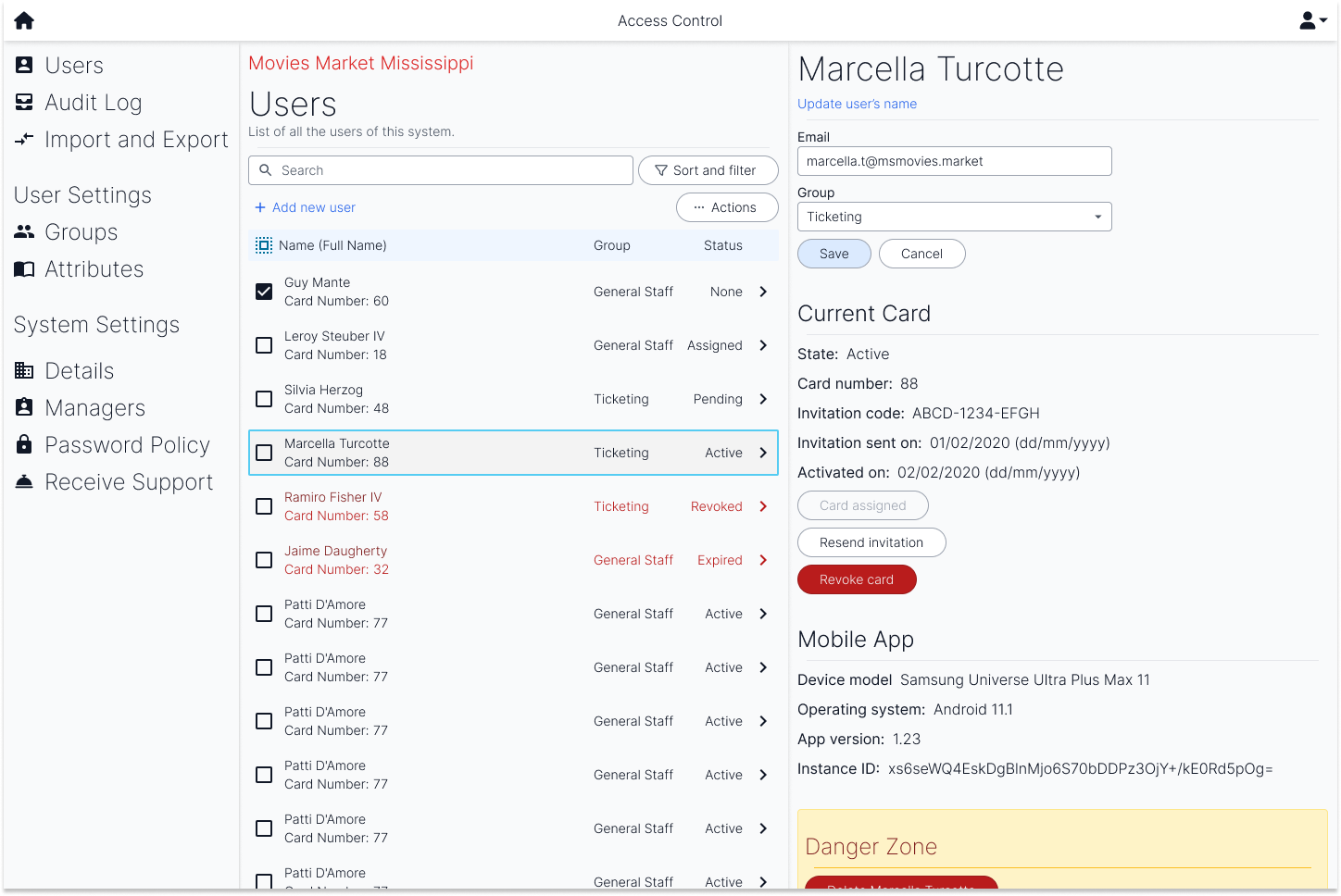
The desktop layout of the user’s page resembles the two user screens but makes better use of the size of a desktop landscape layout. The two screens are side by side to allow for quick editing and viewing of users.
Conclusion
When presented to testing teams, we saw the users find familiarity in the naming of the different sections, such as groups, that also appear in access control software. They were able to identify the relevant features they wanted to use in a short period of time and overall, enjoyed the experience.
However, due to a lack of design system, some elements—such as the search field—do not feel as connected to the rest of the design. This also made it more difficult to achieve a design that resonated with the company.
Overall, the design was clean, and achieved an experience sufficient for a first release. However, the design may not have been tested sufficiently with real world users and could result in misguided user experiences.